The website that almost sold tours.
People don't buy an itinerary. They buy who they get to become on it.
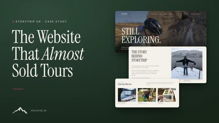
storytrip.uk runs small-group journeys through Scotland. They came to us with a website that worked, but didn't do their story justice.
We built them a new one: bold adventure styling, sweeping mountain photography, tour packages and prices. It looked good.
“It's nice. But it's not us.”
That sentence changed the entire project, and led to something far better than we had first imagined.
Three versions, one journey
The website storytrip.uk started with, our first adventure-tour concept, and the final story-led experience. Together they show the work moving from presenting tours to expressing what a storytrip.uk journey actually feels like.
Where it all began
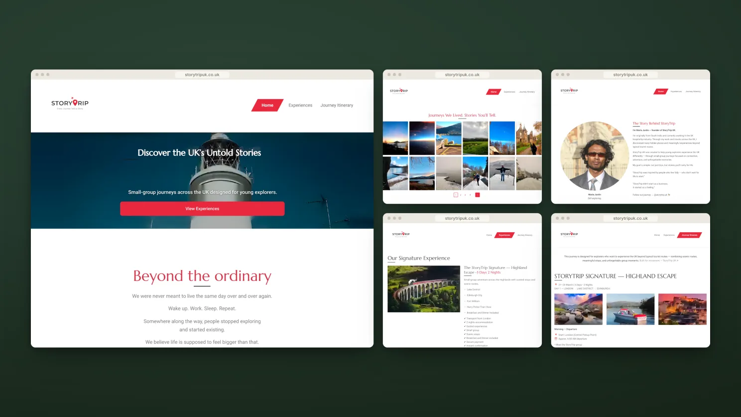
The original site did the basics. It listed trips, displayed contact details, and worked.
But if you covered the logo, you couldn't tell who it belonged to. It explained what storytrip.uk offered, but said very little about why anyone should care.
The client knew something was missing. They couldn't quite name it yet.
The obvious plan
When someone says “adventure travel website”, your mind paints a familiar picture: rugged hills, a bold headline, rows of tour packages and a prominent “Book now” button.
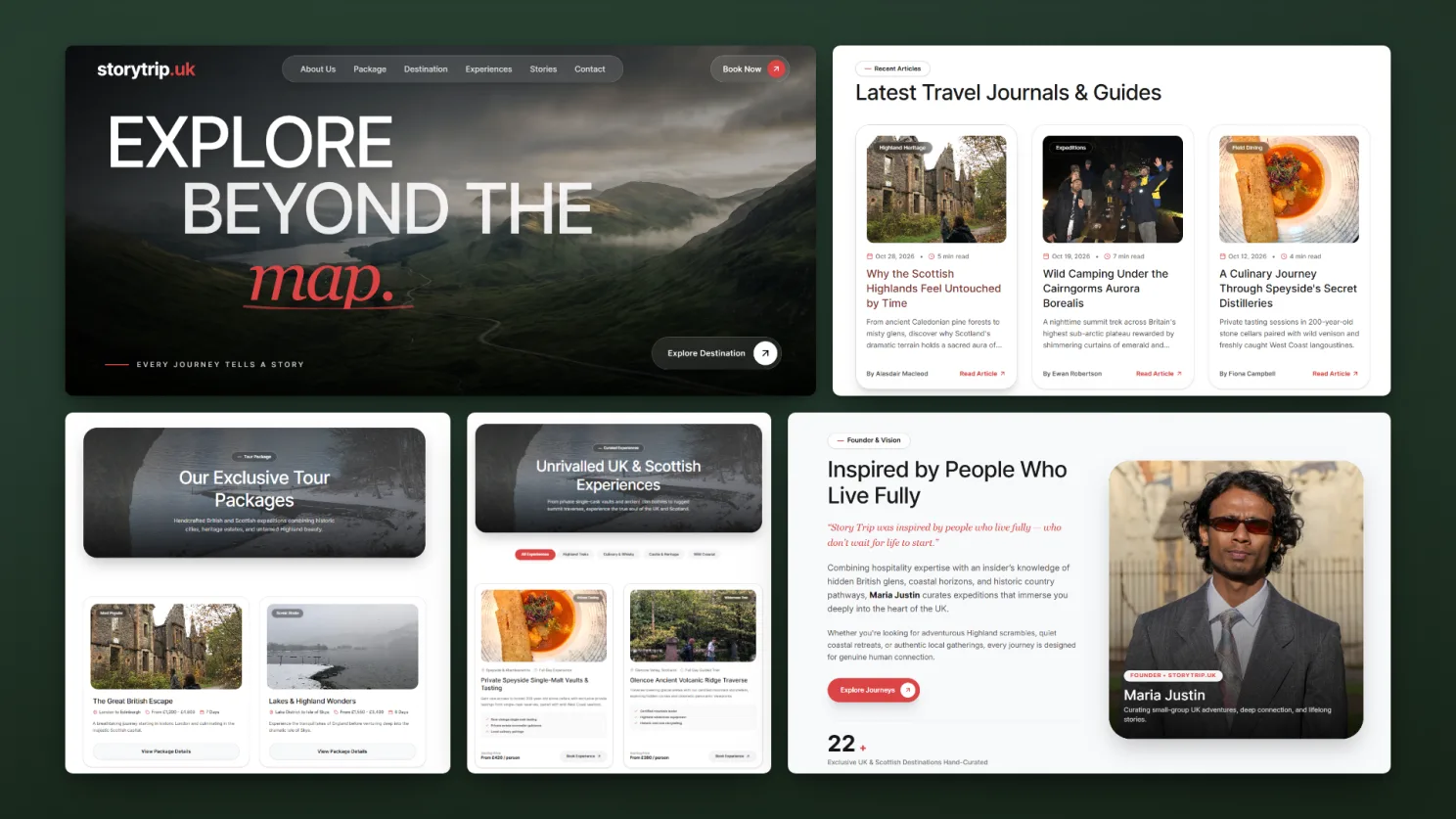
So that's what we built first, and we built it quickly. Within days there was a complete website: home page, destinations, tours, stories, contact page and more, with the confident headline “Built for Movement” and tour cards with visible prices.
It was a clear step forward from where they had started. It looked like a proper travel website. And that turned out to be the problem.
“It doesn't feel like us”
The client didn't hate the design. They hated what it said about them. Every adventure company online seemed to look the same: mountains, oversized text and price tags. We had made a better version of the familiar when they needed something unmistakably their own.
What storytrip.uk really offers is different. Guests don't remember the itinerary first. They remember the unplanned moment: a laugh on a freezing hilltop, strangers becoming friends over lunch, a view nobody expected. That is the real product, and a brochure cannot sell it.
A brochure shows you the mountain. A story makes you feel the cold air and hear the person laughing beside you.
The brief shifted from “Show people our tours” to “Let people feel what it's like to be there.” It was a harder brief, and a much better one.
We tore it up
We didn't tweak the first version. We rebuilt the thinking behind it.
- The question changedBefore: “What tours do we offer?” After: “What will you feel?”
- The visual language changedThe loud red disappeared. In came deep forest green, warm paper-white and earthy browns, with headlines in an elegant editorial typeface. The site stopped looking like a sale and started feeling like a book you didn't want to put down.
- The structure changed“Pick a package” became “Tell us what kind of trip you want to have.” Visitors describe the feeling they're looking for, and the storytrip.uk team shapes the journey around them.
- New pages appearedPages that only make sense when a brand leads with people rather than products: student experiences, partners, accessibility, frequently asked questions and story-led journey pages.
Looking back, that single day of rethinking was the most valuable part of the entire project.
Teaching a website to slow down
Most websites rush you. We wanted this one to do the opposite.
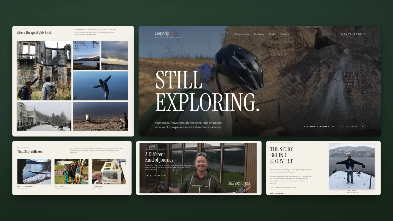
Halfway down the home page, something unusual happens: the page stops moving down and begins moving sideways, like walking slowly past a wall of framed photographs. A frozen lake. A muddy trek. A long table of friends laughing.
Built for Moments. Every trip has one. Not the postcard moment you planned for. The one that finds you.
- Pages glide rather than jerk while scrolling.
- Headlines and photography appear gradually, as if being unveiled.
- Every transition moves at a calm, deliberate pace.
That section captures the whole company in a few seconds. It was also the part we reworked most. We kept refining it until the visitor stopped browsing and started imagining.
Stories instead of listings
With the foundations in place, every part of the site received a distinct voice.
- StoriesA magazine-style space for video and long-form writing from real journeys.
- JourneysItineraries written as narratives visitors can step into, rather than lists of times and places.
- Student experiencesA dedicated area for schools and youth groups.
- AboutLess “company history”, more “meet the people who'll be standing beside you”.
- Plan your tripA guided form covering dates, group size, budget and the experience visitors hope to have. Every enquiry goes straight to the team, along with a record of where it came from.
The visitor journey now mirrors the company's philosophy: feel it, imagine it, tell us about it. Pricing appears later, as part of a friendly conversation, not as a sticker on the front door.
Ready for the real world
Most people will first meet the site on a phone: during a commute, on a sofa, or while imagining their next escape. The final phase focused on making the experience work well everywhere.
- Clean navigation that stays out of the way and adapts to every screen.
- Clear, readable legal and policy pages.
- Cookie consent and accessibility information.
- A safe, tested publishing process, so updates never put the live site at risk.
The first version told visitors where they could go. The final version makes them wonder who they might become when they get there.
The journey at a glance
The original
Informative but forgettable. It led with trip listings, used a conventional browsing experience and asked visitors to contact the team when they were ready.
Our first attempt
More confident. “Built for Movement” brought a bold red adventure identity, prominent packages, visible prices and a familiar route to choosing a trip. Polished, but it still looked like an adventure brand visitors had seen before.
The final version
Unmistakably storytrip.uk. “Every trip has one” shifted the focus to moments and people. Forest green and warm paper tones replaced the red, slow cinematic movement replaced conventional scrolling, and visitors describe the experience they want instead of choosing a package.
Five things this project taught us.
Show early. Speak honestly.
We got the client's real reaction in the first few days, not at the end. Early honesty is one of the least expensive and most valuable things in any project.
“I don't like it” is a gift.
It often points to something deeper than colour or typography. It reveals what the brand truly stands for.
Your strongest story isn't your product list.
It is the feeling people carry after using what you made.
A good feeling is built from small decisions.
Pacing, image quality, load speed and spacing all add up to the sense that “this brand understands me”.
The invisible work matters most.
The details visitors never notice are often the ones that stop them from leaving.
Your business is probably more than its price list, too.
Let's find the part people actually remember, and build the experience around it.
No commitment required. We'll review your brief and tell you honestly if we're the right technical fit.